Aarna — one layout, five pickles
A wordmark and a label system for Aarna's range of five pickles. The layout never changes; the colour, a badge and an illustration change with the flavour.
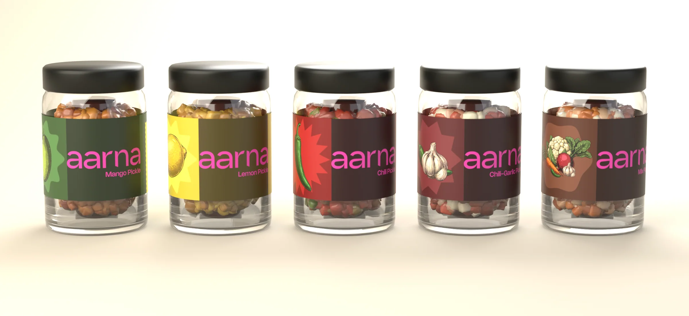
A mockup, not a photograph: each label wrapped once round a 65 mm jar, rendered in Blender.
The range
Aarna Indian Foods makes pickles. This is the label for its range of five: mango, lemon, chili, chili-garlic and a mixed pickle.
One layout, five flavours
Every label is the same strip: the flavour's illustration in a badge, the wordmark and flavour name on a dark panel, then two stamp-edged panels for the label information. Only three things change from jar to jar: the colour, the shape of the badge and the illustration inside it.
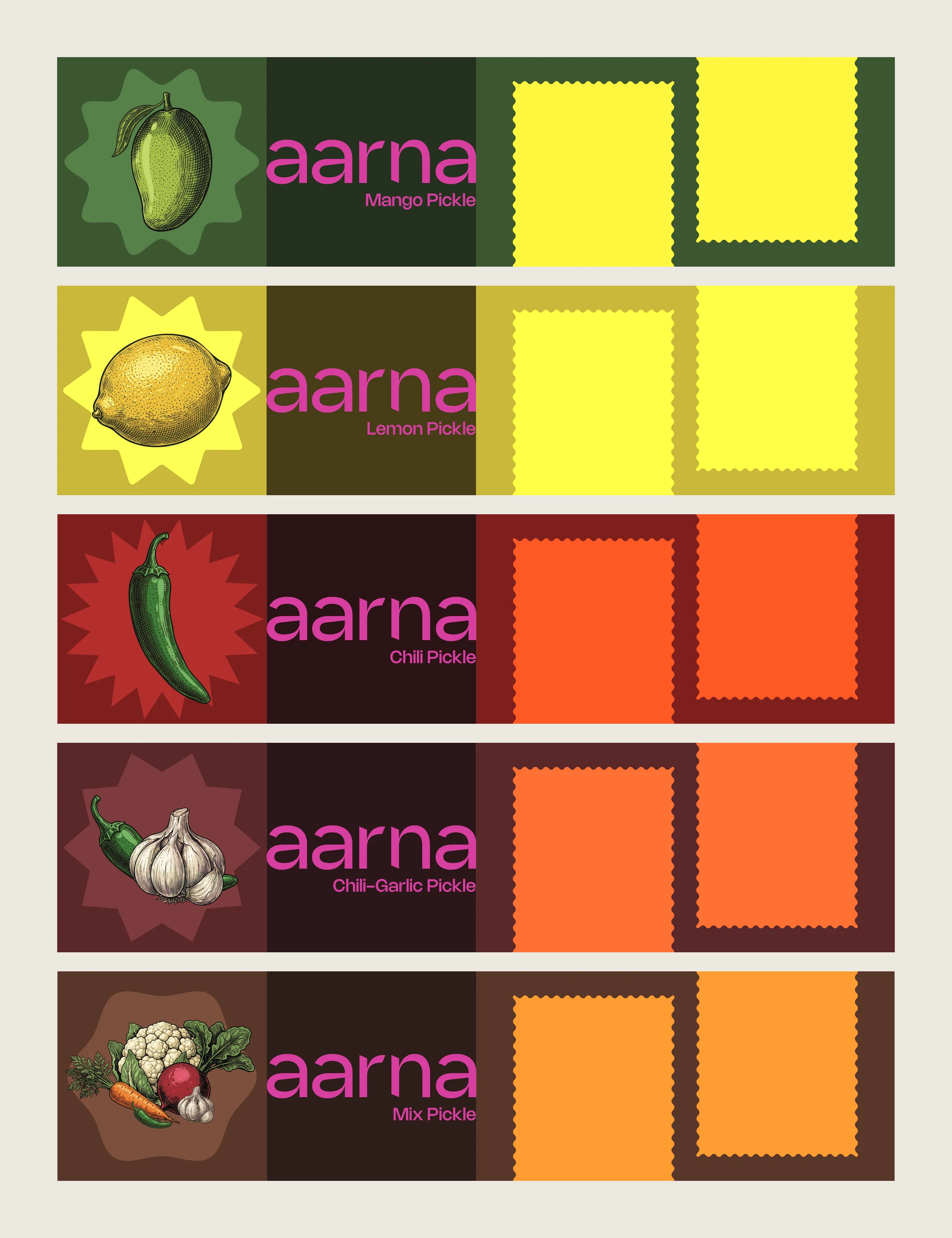
The five labels, flat.
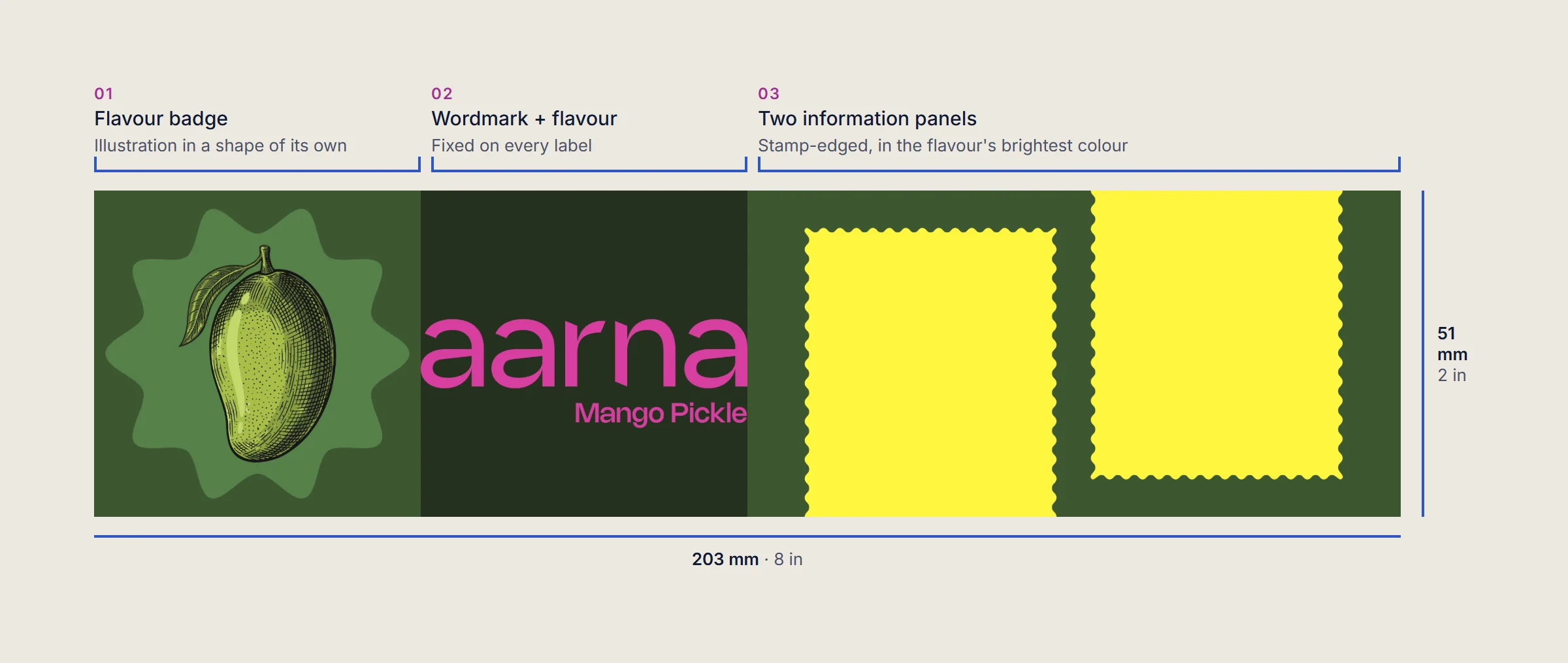
One label, three zones.
A shape for every flavour
Each illustration sits in a badge of its own: a soft scalloped star for mango, rays for lemon, a sharp burst for chili, a star for chili-garlic and a loose rounded shape for the mixed pickle. The flavour's colour runs from the badge into the background and the two information panels.
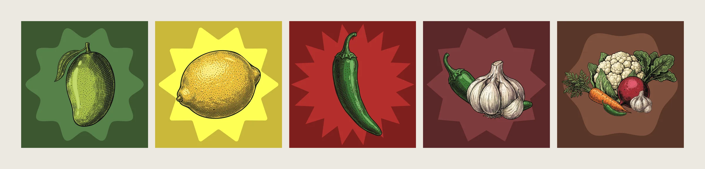
The five badges, cropped from the labels.
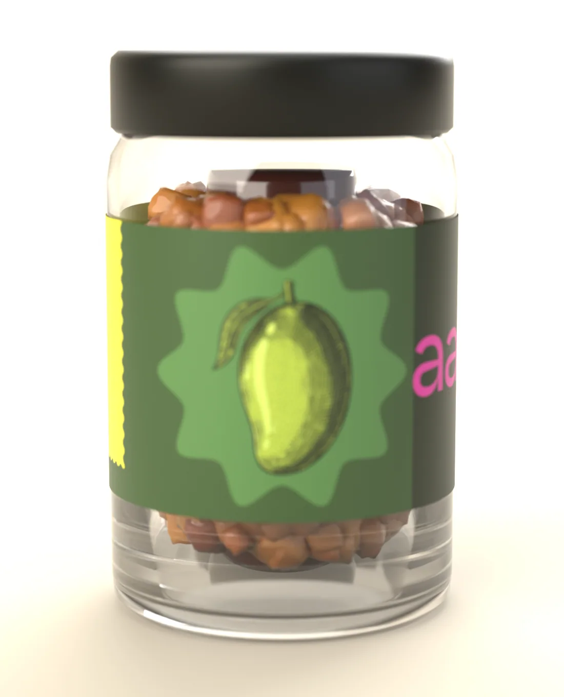
The mango jar, turned to its illustration (mockup).
The wordmark
The wordmark went through several cuts of a lowercase “aarna”, a title-case version with the line “An India Food Chain”, and a heavier display version, before settling on the lowercase mark in pink. Pink is the one colour on every label, so the wordmark is what ties the five jars together.
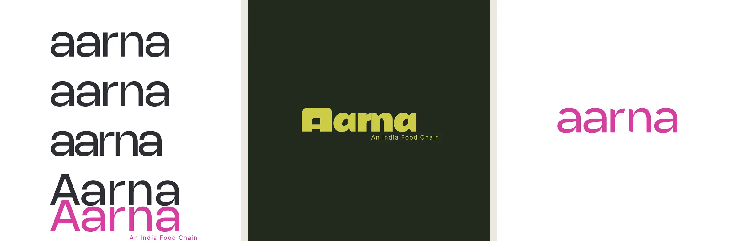
Explorations (left and centre) and the final mark (right).
Earlier rounds
The first label rounds were built around the mango alone: a repeat of mango silhouettes, a title-case wordmark in a coloured shape, and a framed version with a patterned border. Moving to one illustration per flavour is what let a single layout cover the whole range.
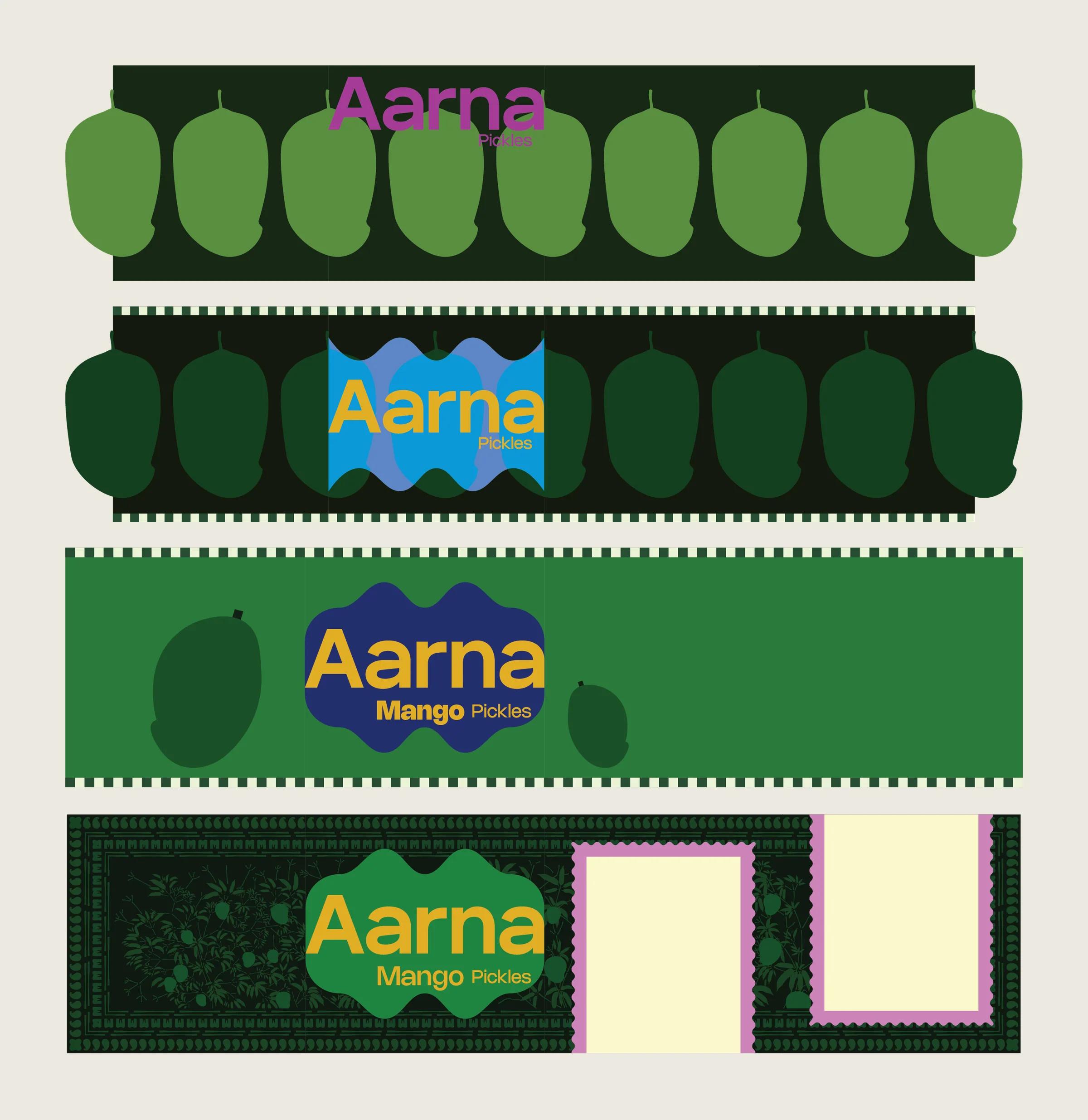
Earlier rounds, all for the mango pickle.
The wordmark, the label layouts and the colour and badge system are mine. The jar mockups on this page were rendered in Blender by an AI assistant from the final label files; they show how the labels wrap, not printed jars.